ANNOTATED CREATIVE PROCESS - IDENTITY.
Research.
The theme of our task was ‘Identity’. This topic interests me very much. I began this creative process by researching identity, and associated factors to the concept of identity.
I discovered many facets of identity that held my attention. Of particular interest to me was the notion of a person’s identity being defined as a ‘persisting entity’ which is also known as personal continuity (Wiki, identity formation). Previously I had concluded that a person’s identity cannot be defined, because it changes across the span of an individual’s life. This idea of a ‘persisting entity’ clarified for me that a person’s identity does indeed change and evolve, but it is important to note that it changes slowly over the course of their life. Any period in their life where they can be identified by a set of particular characteristics can be defined as a person’s identity.
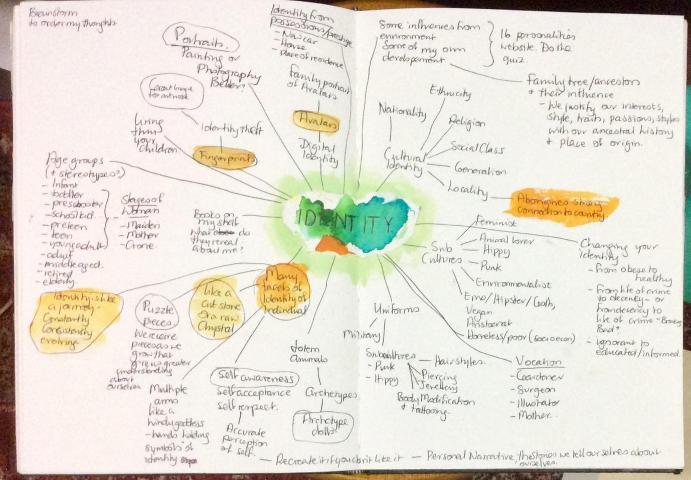
Mind Map.
I produced a mind map diagram to help me make order of my thoughts. The process of creating the mind map triggered many ideas for artworks to communicate the theme of Identity. There was no one clear creative path or trajectory to pursue. I didn’t fight this seemingly disjointed thought process but trusted that through the jumble, a satisfying artwork would be produced.
Finger Prints.
My first creative exploration was with fingerprints.
After a preliminary search of artwork with fingerprints, where I found images that appealed to me, I had the idea that words (or sentences) could replace the lines of a fingerprint so that the fingerprint becomes a kind of story about the owner of the fingerprint. This inspired my first artwork.


A second creative trajectory was triggered by the story fingerprint idea. The story or narrative of an individual’s life can be like navigating a maze. In a maze you come up against dead ends and wild goose chases as well as times when your path is clear of obstacles.
I thought the most controlled media to use to produce these artworks was pen and ink, especially considering the fine detail required to write very small.
The tessellation artworks produced by M. C. Escher in pen and ink came to mind. These tessellations could convey something that is repeated or important in a person’s identity.
RESPONDING – Watch the Escher power point.
Go to the below website, scroll down to ‘M.C.Escher/ Secondary’ to view the PowerPoint. Pay particular attention to the tessellation slide, Escher produced these with pen and ink.
https://www.ngv.vic.gov.au/school_resource/escher-x-nendo-between-two-worlds/
Discuss with your friend why you think Escher produced these tessellations in pen and ink when he used printing methods with so many of his other artworks.
MAKING – Watch this video and then create your own tessellation. Use your favourite colours to convey something of your identity.
https://www.youtube.com/watch?v=Lc4LGZwlcvs
Streamlining exercise
https://www.youtube.com/watch?v=pnokTjHrhBE
Extending exercise
https://www.youtube.com/watch?v=212XC1zfxXY
I briefly explored my bookshelf as a means to communicating the theme of ‘identity’. It was a a standalone image that only conveyed my interests. I was not motivated to explore it further, it was a creative dead end.
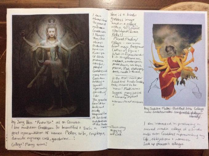
Collage.
My next creative trajectory was to explore the image of the Goddess with multiple arms. I felt this motive would effectively communicate the many activities I undertake, represented by various objects held in the many hands of the figure. I found two interesting artworks of multiple arm Goddesses. The artwork by Suchitra Mattai is a collage, an interesting technique to use to develop a multi arm image. Picasso and his collages also came to mind.
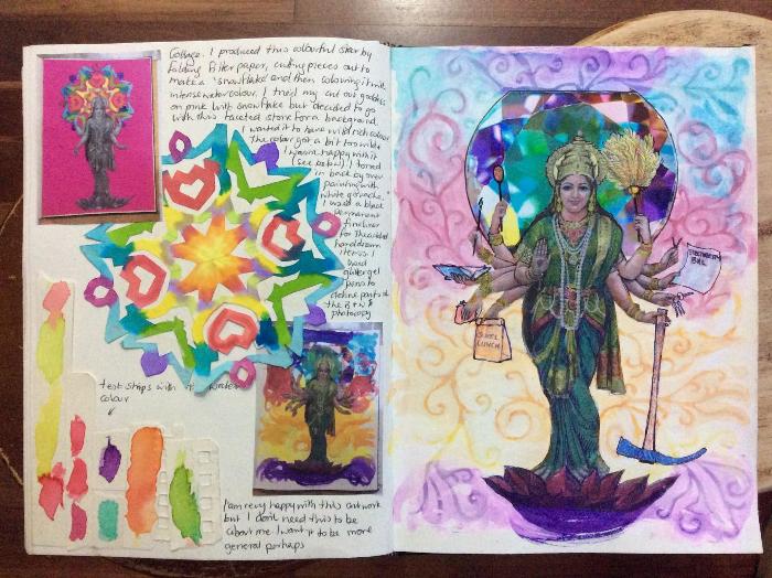
In keeping with the typical representation of Hindu Goddesses with an ornate circle of repetitive detail behind their head, I made a paper snowflake from filter paper and coloured it with watercolour paints that bled and merged nicely with other colours. I preferred the crystal image zi used (see below) as the Goddesses’ backdrop in the finished artwork.
I was unhappy with the bright colours I painted in the background so decided to subdue the colours while adding detail, by over painting the background with white gouache. I made the paint too thin and had to paint over the swirls three times to achieve the desired opacity of white. I added symbols of the many roles I perform, the mattock for gardening, the school lunch for motherhood, the purse for bread winner, the book for tertiary study, the paint brush for artist, the wooden spoon for providing meals, the duster for house keeper, the clothes peg for maintaining domestic duties and the bill for representing responsible adult.
I was very happy with the final result of this artwork but I concluded that I didn’t actually want it to be about me. I wanted to represent ‘Identity’ in a more general way.
Here are some activities to undertake in the theme of collage.
RESPONDING – Watch this video about Picasso’s papier colle – (collage).
https://www.youtube.com/watch?v=IHmeRiR5s_U
What art elements and principles would you use to describe Picasso’s collage artwork?
MAKING – Watch this video about how to produce a collage.
https://www.youtube.com/watch?v=z5PVeuRadAQ
Using available material from school, home, even the recycle bin, make your own collage with the intention of it communicating something about your identity.
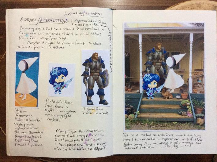
Avatars and Appropriation.
I reflected on the work I had produced so far and concluded it was all very serious. I referred to my mind map and decided to explore the idea of digital identities, particularly as so many people are online gaming in this present time, and many people feel they identify more closely with their online avatar, or character, than they do to their actual life.
I had the idea to appropriate images from the internet to represent a mother, father and child at home in the real world. This was meant to have a comedic edge. I chose a guard from World of Warcraft (https://worldofwarcraft.com/en-us/), Ida from Monument Valley (https://www.monumentvalleygame.com/mv2), and a player’s avatar from an online game called Prodigy Game (https://www.prodigygame.com/) which is aimed at primary age children with the purpose of teaching them maths.
I had to take care in selecting the images to ensure they were facing the right way and were the right size to be convincing. I carefully cut out and glued the back character on first, then the white character (Ida) followed by the child. I had to trim extra parts off the images feet to work around the pet dog. I added extra shading to ground the characters so they didn’t look like they were floating.
While I was happy with this resolved artwork, I wasn’t motivated to explore this theme further. I also realised I had gone away from my focus on individual evolution.
RESPONDING – Watch ‘The Meaning of Appropriation in Art’.
https://www.youtube.com/watch?v=OpjzJdojNS8
Discuss in small groups whether you think it’s acceptable to appropriate art or not.
MAKING - Print an image of your gaming avatar (if you have one). Place it in a real world environment. This artwork could well have a sense of humour conveyed in it. How funny can you make it?
Environmental Art.
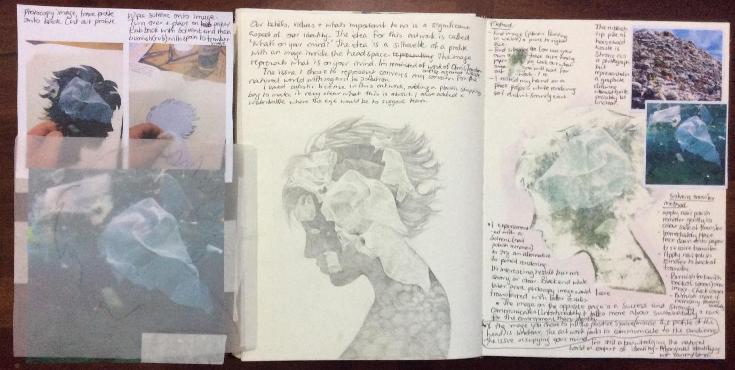
Our beliefs and values are a significant aspect of our identity. The issue of pollution, sustainability and preservation of the Earth is a concern I share with many people. Chris Jordan is an environmental artist and I am interested in his work. He recently produced a clip that moved me. It was about the devastating damage that rubbish that ends up in the sea is doing to albatrosses. These magnificent birds ingest plastic litter thinking it is a food and it is killing them and their offspring.
The idea of this artwork is ‘What’s on your mind?’ I found a silhouette of a profile and an image of rubbish suspended in the ocean. I traced the outline of the profile onto the rubbish image so I could more easily draw the detail that was inside the profile line. I used artistic licence and added a plastic bag where the person’s mouth would be, suggesting suffocation, and a discarded water bottle where the eye would be to suggest tears and sadness at the damage rubbish causes.
I tried to extend the trajectory by experimenting with solvent transfer. This is where you brush or wipe a solvent like nail polish remover or eucalyptus oil onto the coloured, printed side of a laser printed image. You then place the image face down onto paper you want to transfer onto, and burnish (or rub firmly) with the back of a spoon. The results are often grainy, producing a subdued image with limited clarity. This experiment failed as the image failed to be recognisable.
I also considered using a giant rubbish pile as my image for the drawing but decided against it as it wouldn’t be immediately recognisable as a rubbish pile.
I have another idea for acknowledging the natural world in the context of identity that I will explore next.
RESPONDING – Watch this video about Chris Jordan – Artist against waste.
http://sustainabilityatmwps.global2.vic.edu.au/2014/02/18/chris-jordan-artist-against-waste/
Use a Venn diagram to compare and contrast Jordan’s video and the pencil drawing above.
MAKING – Watch this video on using pencils.
https://www.youtube.com/watch?v=FVWxlXfMLVU
Find an image that represents what’s on your mind. Get a friend to take a photograph of your profile and produce a drawing conveying to the audience what holds important to you.
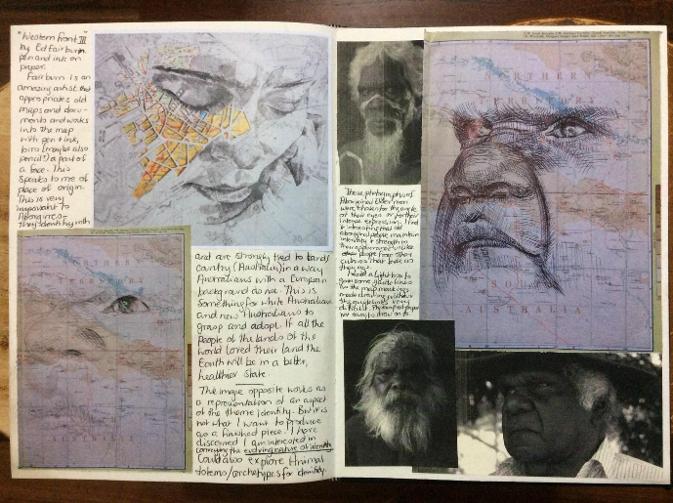
Aborigines Identifying with Country.
At the start of this creative process, one of the images I found during an artwork search that made an impact on me, was the drawing ‘Western Front III’ by Ed Fairburn. This Welsh artist collects old maps and documents and works into the markings on the documents to incorporate a portrait .
I have great respect for Aborigines connection to Country and I wanted to convey this in a similar style to Fairburn.
I found an old atlas of Australia that provided me with an image of Kata Tjuta (the Olgas) with enough topographic detail to work up into a drawn portrait of an Aboriginal Elder.
I experimented with charcoal pencil but the photocopy I took of the map image had been reproduced on slightly shiny paper and charcoal wouldn’t effectively mark the paper. I also used a light box to gain some guiding lines for the portrait as it was very difficult to orient myself on the map because the map lines were distracting.
I am happy with the final artwork pictured, below, top right. I did find it difficult to hold back from marking the paper, and thus I have lost some of the map markings beneath the portrait.
RESPOND - Watch the Ed Fairburn video
https://www.mikewrightgallery.com/ed-fairburn.html
What art elements and principles has he used to produce his artwork?
MAKING - Pull a page from a provided second hand atlas or old street directory. Print an image of a face. Draw your face image onto your map, accentuating lines of the map to represent the face. Give some consideration to the kinds of people that live in the land represented in your map.
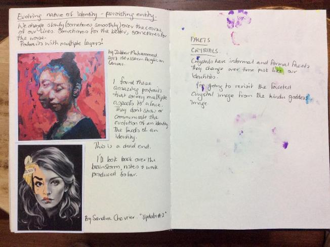
Facets of Identity in Portraiture.
I was still striving to represent facets of identity and the evolving nature of identity. I found the below portraits and contemplated how I could convey the ‘persisting entity’ idea I had at the start of this creative process. While these portraits are magnificent and strong, it was a dead end for my trajectory.
RESPONDING – Consider the differences between a photographic portrait and a painted portrait with the use of a P-M-I chart (plus – minus – interesting).
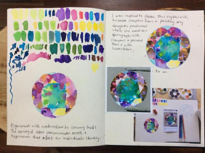
I looked back over my visual diary and discerned a resonation with the faceted, changing, growing, evolving nature of crystals as a metaphor for conveying the idea of ‘persisting entity’ and ‘personal continuity’.
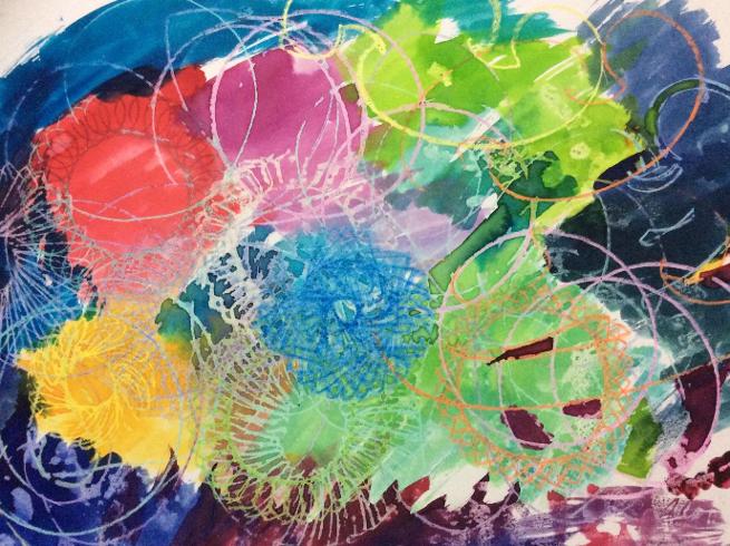
I began experimenting with watercolour to produce an image of a faceted crystal. The colour conveys something of the complexity of identity also. After my initial watercolour sketch, I was influenced by an artwork my daughter produced where she used a Spirograph and French curves to make marks with wax crayons. She then painted over the crayon with watercolour which resisted the crayon marks, and didn’t muddy their colours. See photograph below.
RESPONDING - Read this article about mixed media art.
https://theartofeducation.edu/2019/01/28/10-mixed-media-artists-to-inspire-you-and-your-students/
Discuss with a friend who your favourite mixed media artist was and why.
MAKING - Watch this video and then experiment with mixed media art making.
Facets and Evolution.
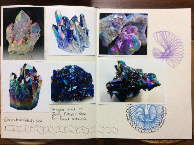
I decided to make a concertina artists’ book as the folds reinforce the idea of facets and a long format of joined pages demonstrated gentle evolution across a significant period of time.
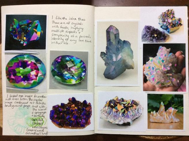
I began collecting images to use in this artists’ book. I also decided to incorporate Spirograph designs to join one crystal to the next.
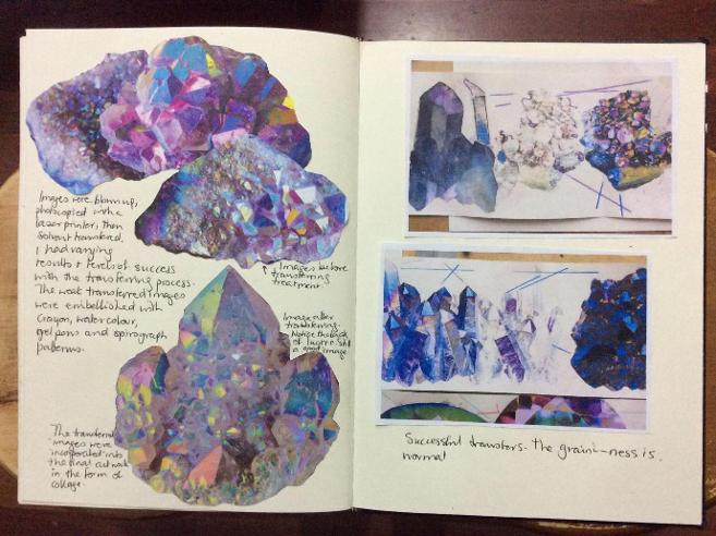
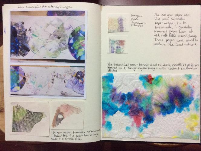
I experimented with solvent transfers on various paper weights, or gsm’s. I found that 150gsm paper responded better to the solvent transfer technique than the thicker 300gsm paper. This surprised me.
Wherever possible I try to exercise sustainable practices in my artmaking. For this reason, I chose to use the blank pages of an unfilled visual diary with 150 gsm pages to make my artists’ book. Interestingly, I discovered that there is a rough side and a smooth side to these pages. The smoother side responds more effectively to solvent transfer.
When I incorporated solvent transfers into my artists’ book, some transfers were more successful than others. The weaker images I enhanced with wax crayon and watercolour splotches. The watercolour was influenced by the unexpected beauty caught in the paper towel (see below, bottom left), that was used to dab excess paint.
The Final Artwork.
Crystals transmutate and evolve from one thing to another while maintaining some enduring characteristics like colour and form. Crystals, like identity, are multi faceted, complex and beautiful.
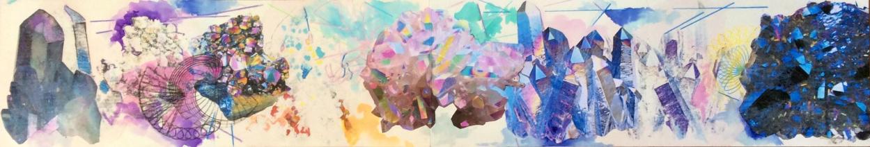
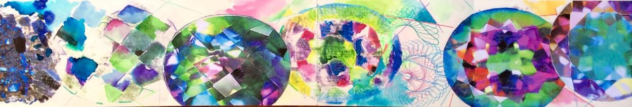
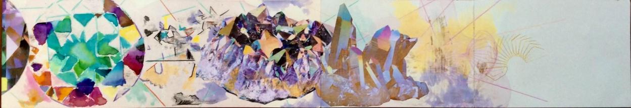
Facets of Evolving Identity. 2019, Ingrid Schmidt. Mixed Media. Entire artwork 14cm by 252cm
© Copyright Ingrid Schmidt